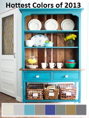
 I love turquoise and I want so badly to have that great turquoise hutch (that we all see and love on Pinterest) in my kitchen, but I have been such a chicken (it doesn’t go with my palette either, but I would have made that my palette if I weren’t such a fraidy cat.) What I am afraid of, is that I will do it, right at the end of the trend and have to change it the next year. (I do this with clothes. PLEASE skinny jeans, don’t go out of style. I JUST gave in. Just barely.) So, I am trying to stay ahead of the curve, so I can enjoy the trends for longer and be more adventurous as I decorate.
In 2013, color is not the only thing that is “in.” Texture is hugely important, possibly more than ever before. Mixing different hard and soft textures will add life and interest in your home. Upcycling old tables, hutches and other furniture with blues and greens mixed with delicate flowers, rustic pallet wood, basket accents and steel elements is a great and balanced mix of composition.
2013 Hot Colors:
Palettes of blues and greens
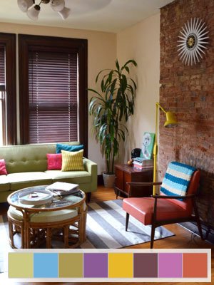
Orange. Pumpkin is huge right now with a bold blue, lime and violet. And touch of gold. How amazing is that chair above? I love that orange chair. Don’t forget the gold. I didn’t think I would ever utter “don’t forget the gold” 10 years ago. 🙂
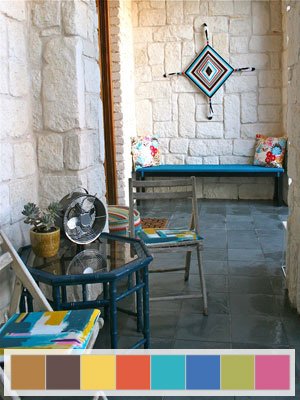
Tangerine with peacock blue and accents of bright pink- this is a tribal inspired theme and is bold, vibrant and beautiful.
Gray and bright white. They are everywhere in 2013. More people are going with bright white furniture and bolder walls or accenting a colorful room with staunch white. It is a clean crisp look that I, personally, LOVE!
Primary Colors. The colors of the rainbow are being used for a lot of different settings. It is especially popular for playrooms, kid’s rooms, bathrooms. I have seen the primary colors painted on walls with white furniture and white accents. Use white furniture in front of dark walls and don’t forget to create galleries with color and white.

Fuschia and Green. Find earthy tones and textures and add a vibrant color, like fuschia to liven it up. Neutral colors are beautiful together, such as greens, browns, and grays and a vibrant color like lemon yellow or fuschia can really come together beautifully.
Other Palette changes for 2013
- Purple is staying
- yellow is soft
- Navy is here
- Neutrals take a more dominant position
- Oranges stay, less red
- Back to brown for a staple (pallet, rustic, leather)
**Don’t forget to mix textures and composition- hard with soft, bolder colors with burlap, rustic elements with steel, hard and soft together for a balanced and grounded feel.
Started reading your articles and couldn’t stop ! I think I must be in exact same season of life as you are…looking forward to more..thanks!
What I am afraid of, is that I will do it, right at the end of the trend and have to change it the next year……. I believe if you love the turquoise, you should go with your heart. Sometimes, I feel people follow way too much. The thing is, followers can never be trend setters and trends are just that, they come and go. I’m not much for following trends unless I truly love them. Kinda like, be your own person.